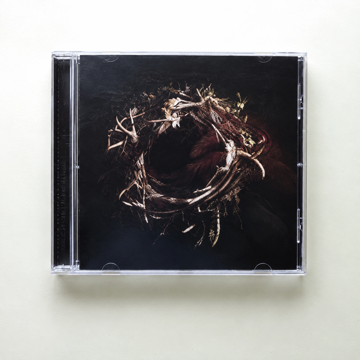
Packaging
LINN
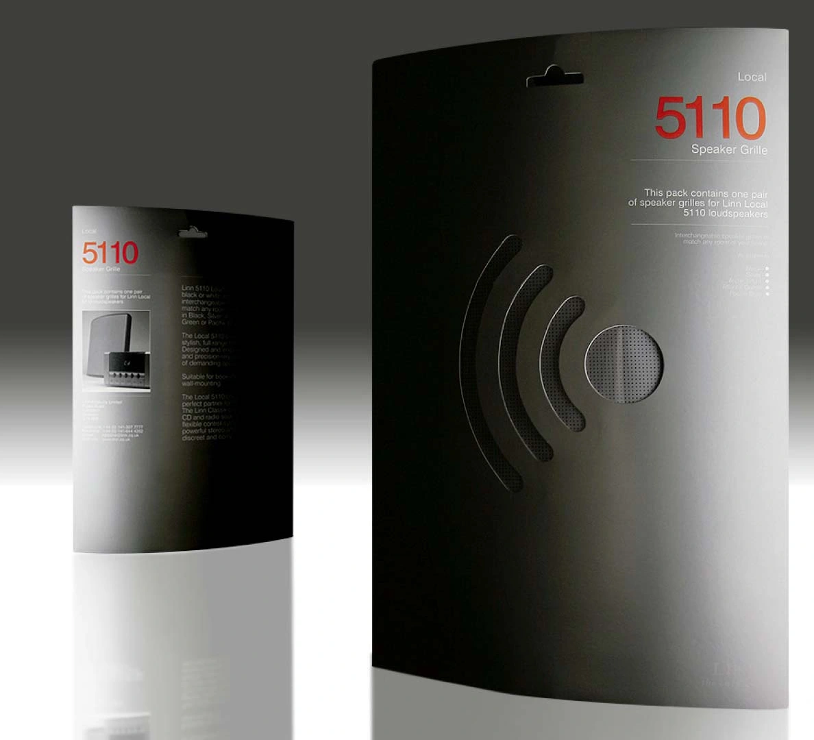
A window that shows the colour.
And refers to the sound.
 Suisse StudioPaul Gray / Design & art direction
Branding / Packaging
A reason
to be seen.
A crowded back bar. A bottle that needed its own language. Paul’s idea puts the shape and the typography to work together.
Explore the project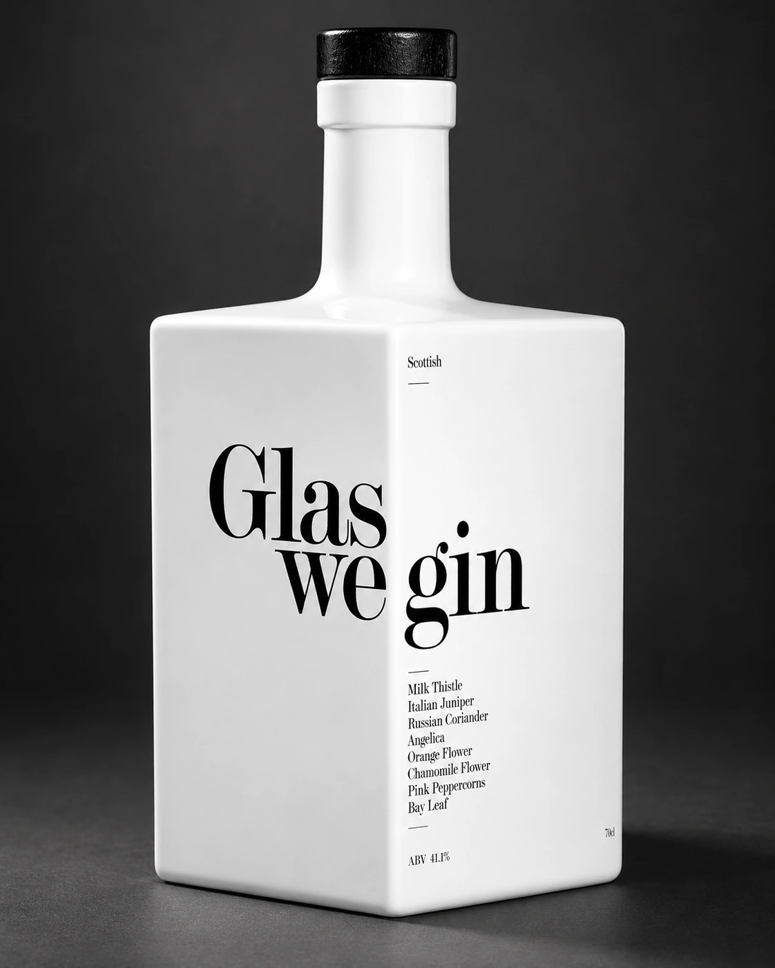
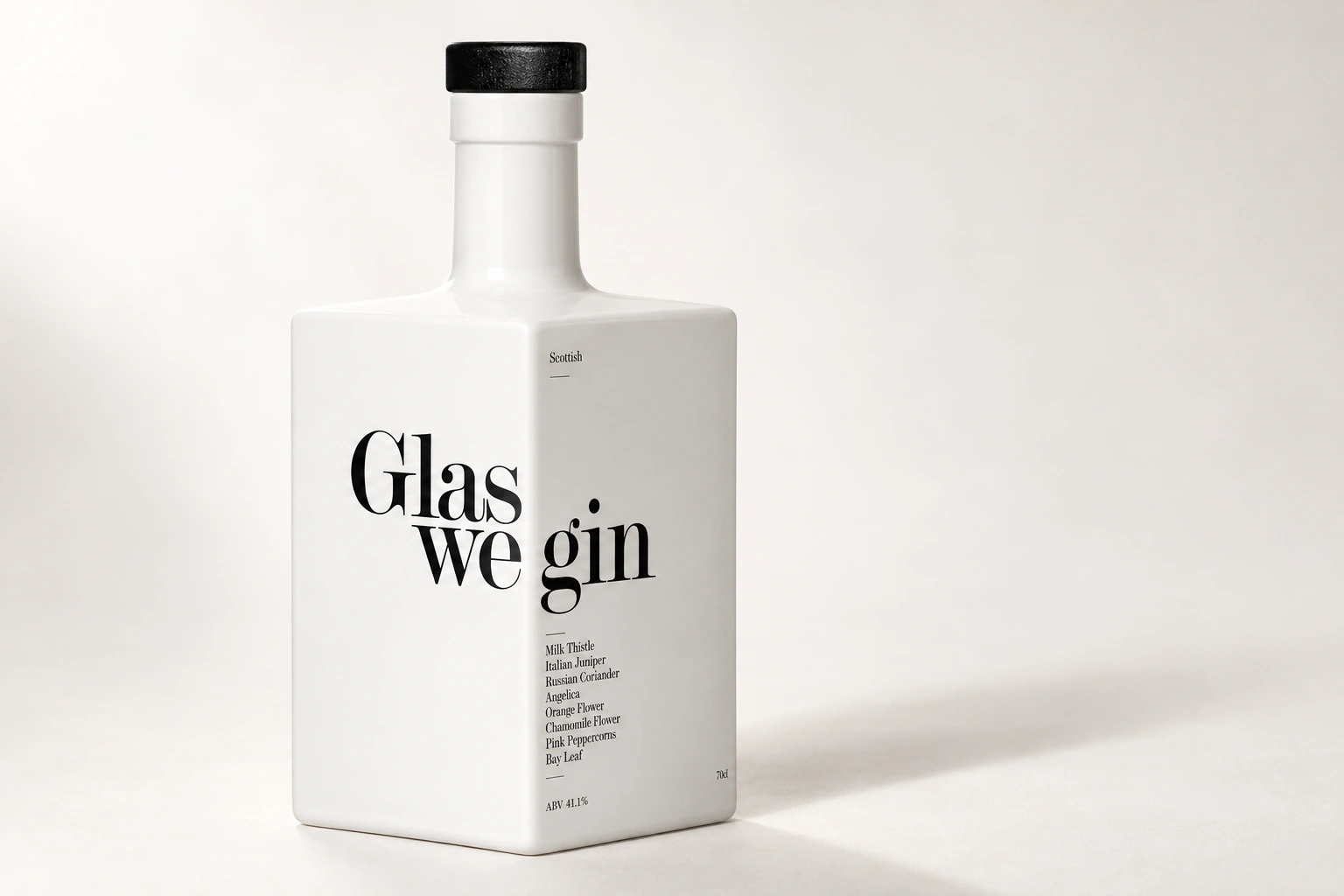
The name turns the corner.
The idea carries across the range.
Concept / Bottle packaging
Gift packaging / Supporting print
Identity / Photography / Print
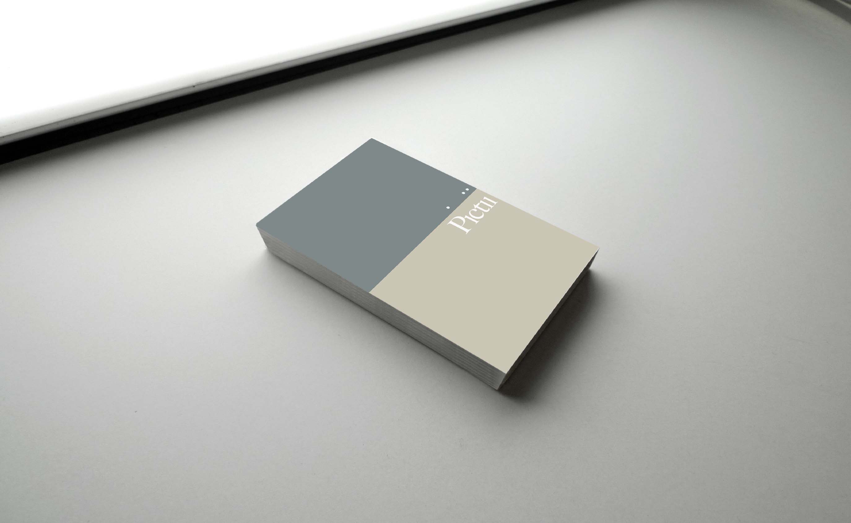
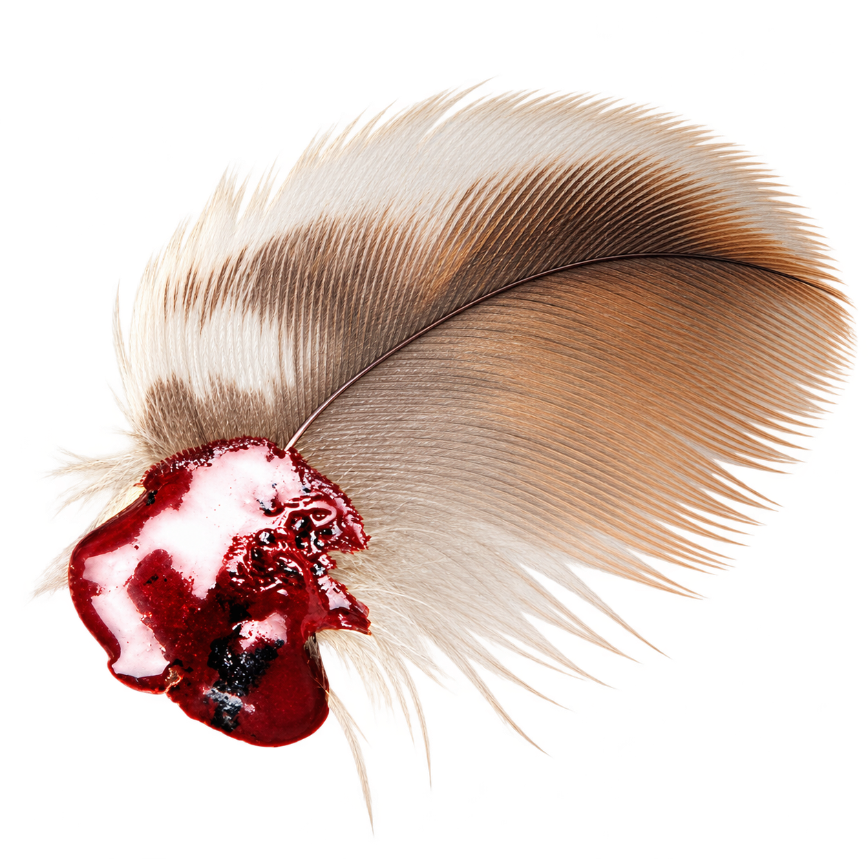
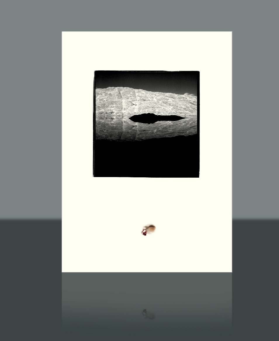
For photographer Craig Mackay. A distinctive name, the horizons in his photographs, and the colours of a feather. The identity begins with things that were already his.
Explore the project
A name.
A horizon.
The dots and the dividing line become a language for the work. Quiet enough to let the photographs speak.
Exhibition / Visitor flow / Interpretation
A way through a vast industrial building. Zone walls, reading totems and historical lightboxes, conceived as one exhibition system.
Explore the project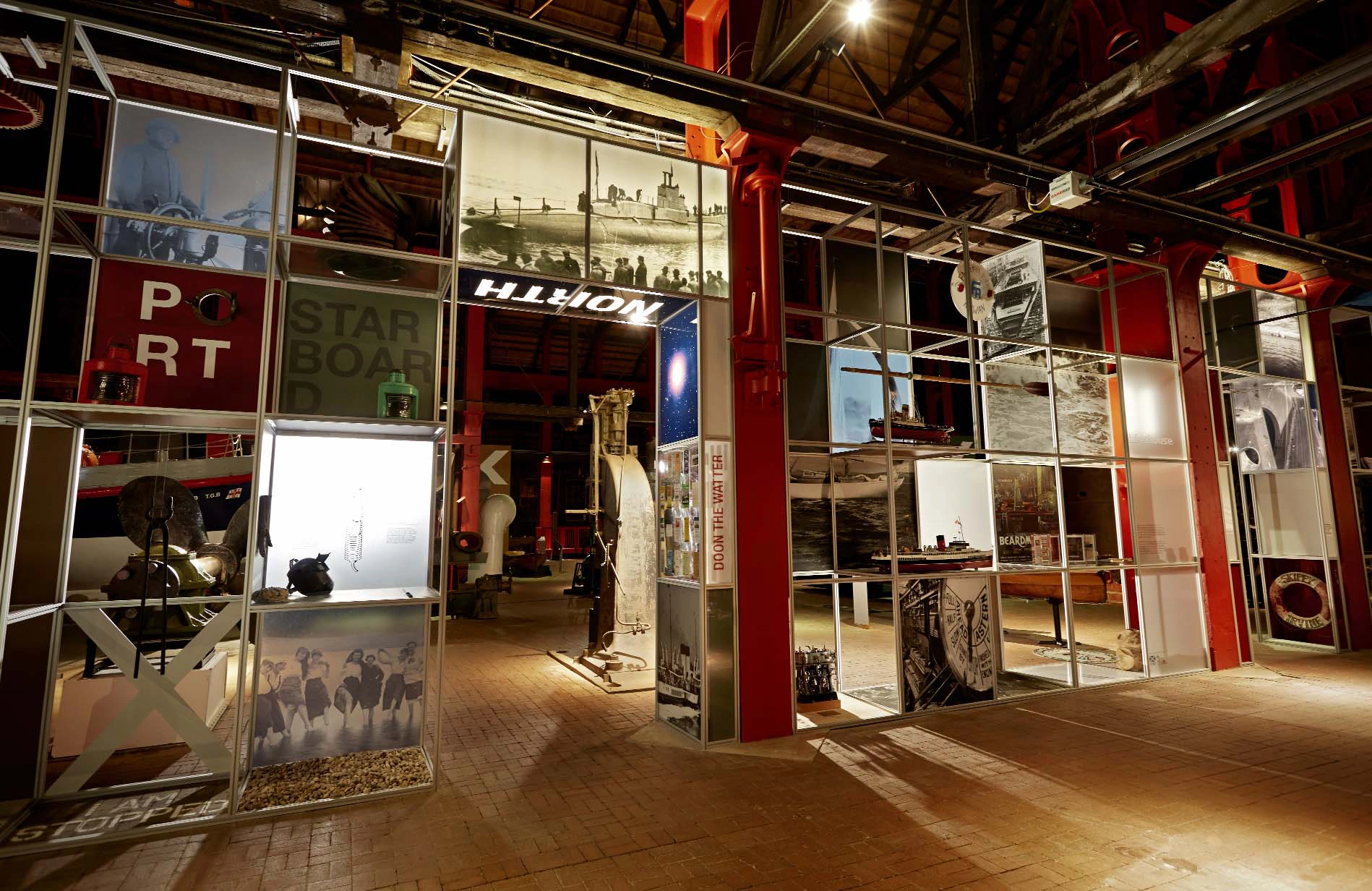
Identity / Print
His surname was already there, inside the word that described his work. The identity brings it into view.
Explore the projectphotoGRAphY / The name within the discipline.
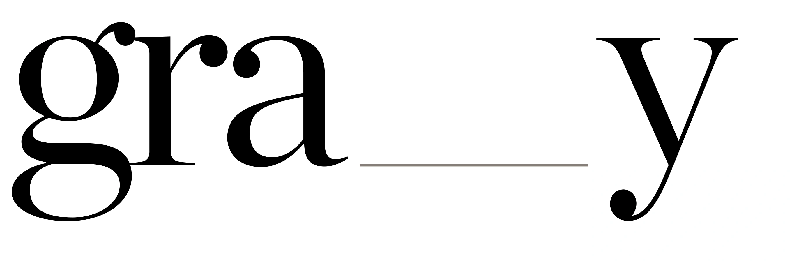
It was there
all along.
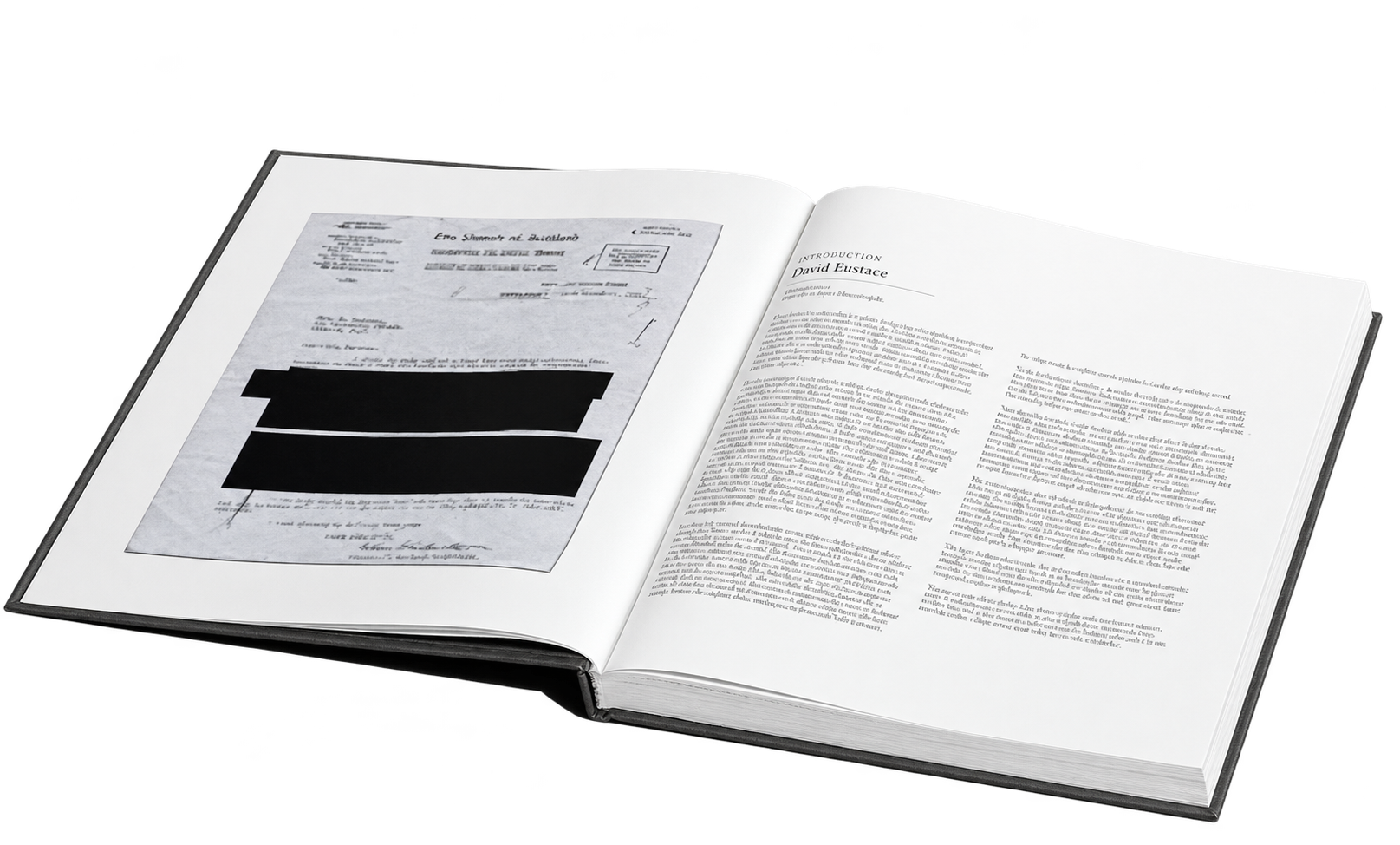
Book / Editorial
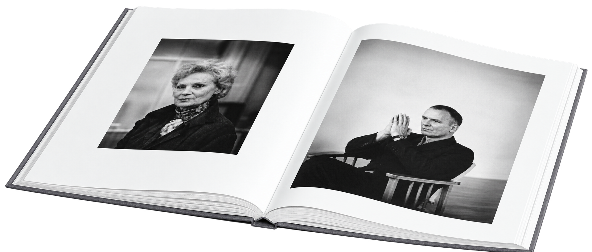
A life in photographs, with a deeply personal starting point. A line from a letter connected to David’s adoption became the title.
Explore the project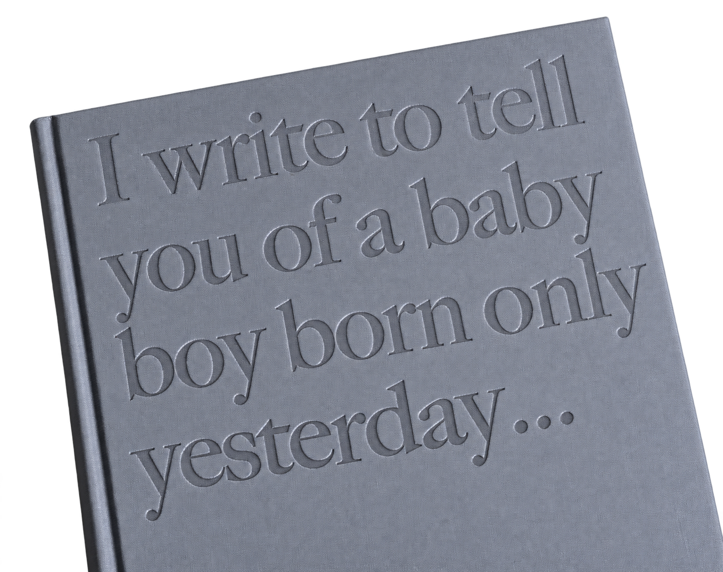
The cover
“I write to tell you of a baby boy born only yesterday…”
Paul made that first written statement of David’s life the starting point for a book looking back over it.
Art direction / Photography
From the first location visit to the final image. Planning the shoot, choosing the team, directing the photography and overseeing the finish.
Explore the project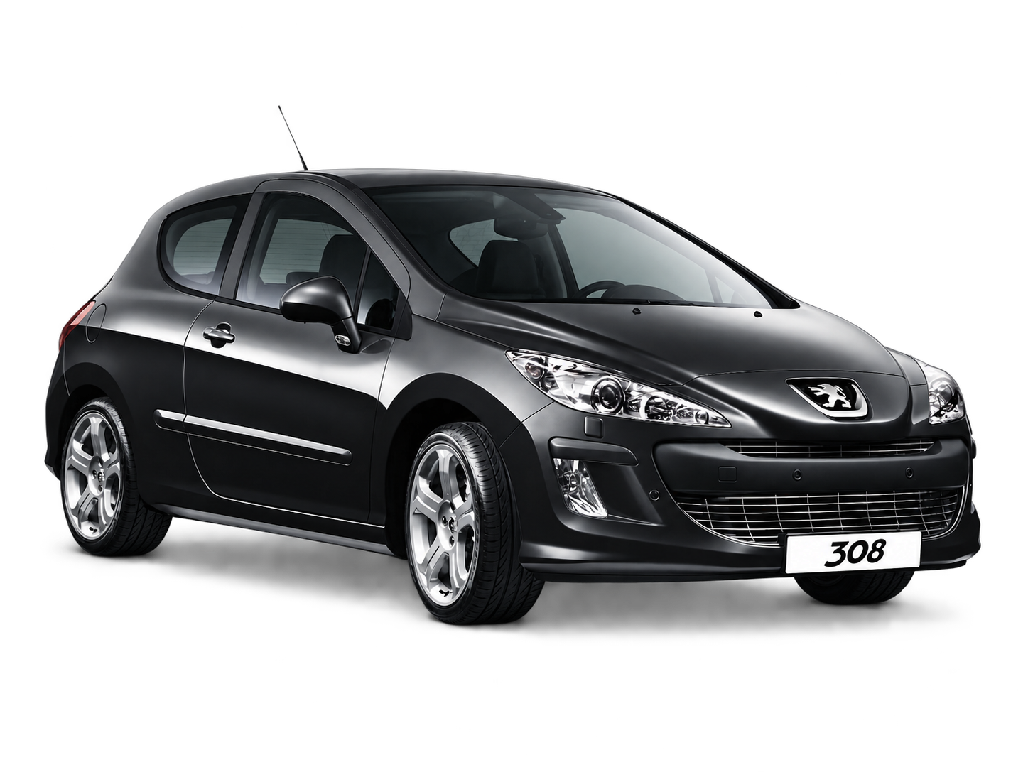
The whole
picture.

Self-initiated / Print
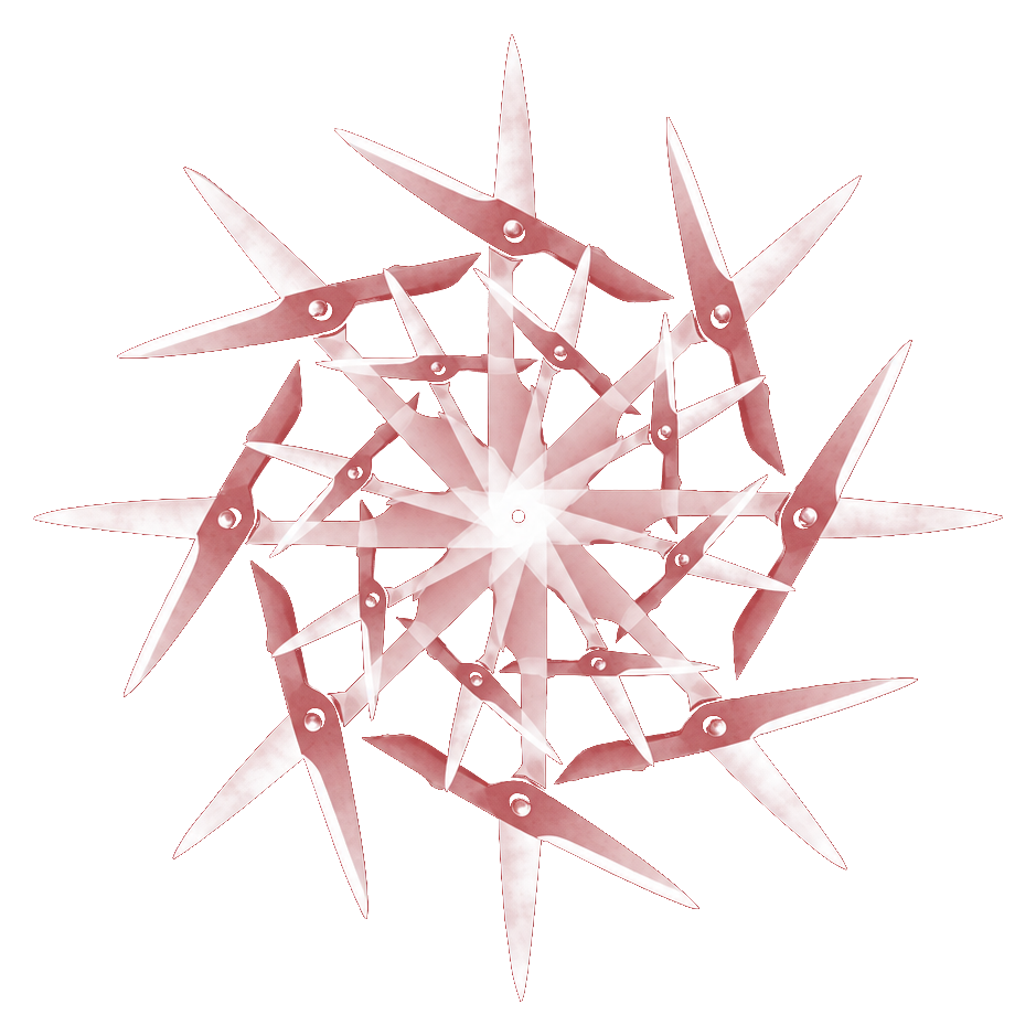
One strict rule: use something from the studio. An everyday tool supplies the shape. Repetition supplies the snowflake.
Explore the project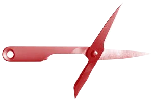
Personal work / Image
The sitter’s own fingerprint becomes the material of her portrait. A likeness made from something that belongs to her alone.
Explore the project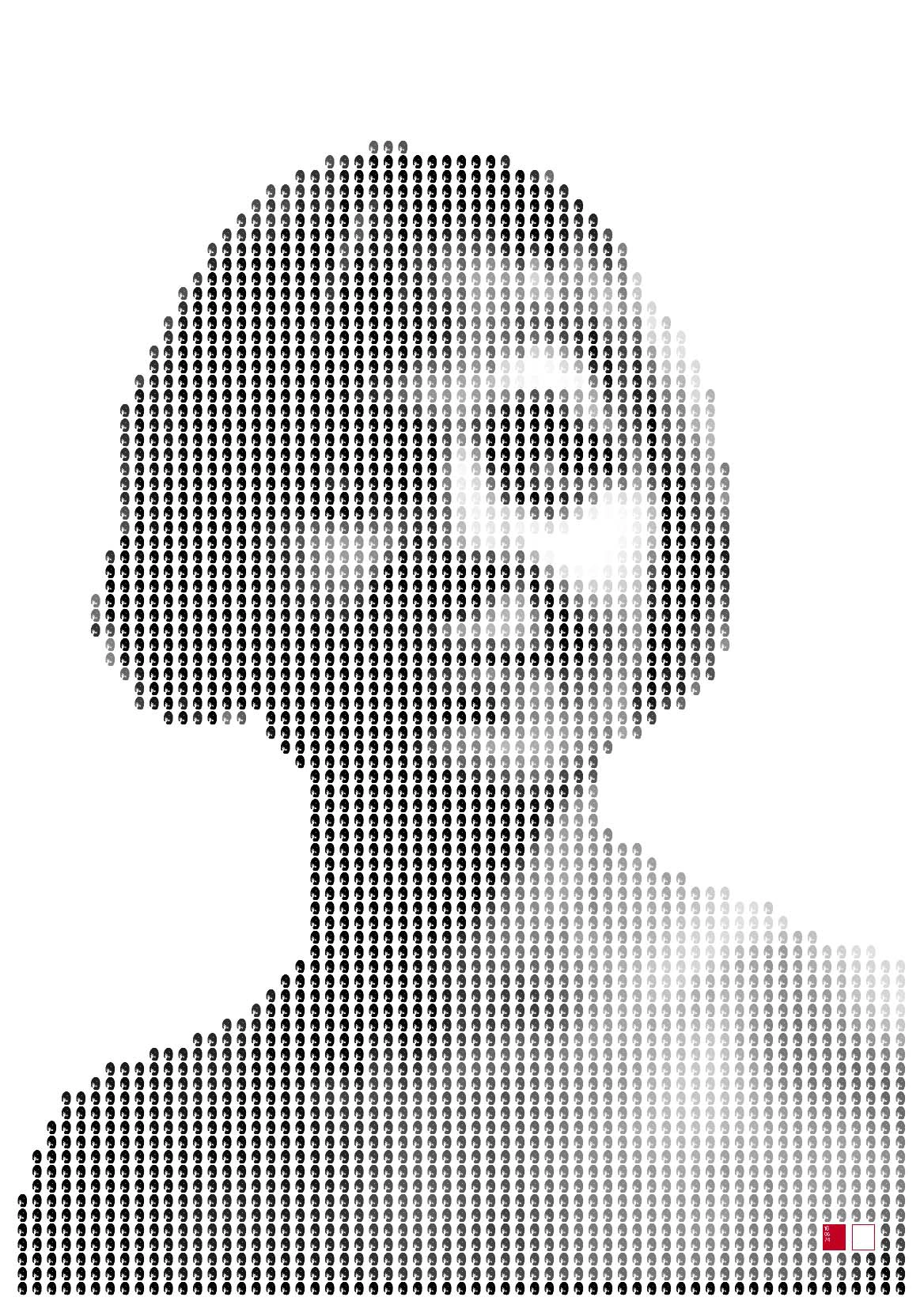
It can be
no one else.
A different line of enquiry.
“Some work and some don’t.
The engagement is the reward (to me).”
A few other things.
Different briefs. Different scales.
Each with something of its own to say.
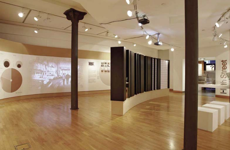
11 / Exhibition / Identity / Film
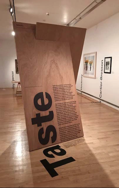
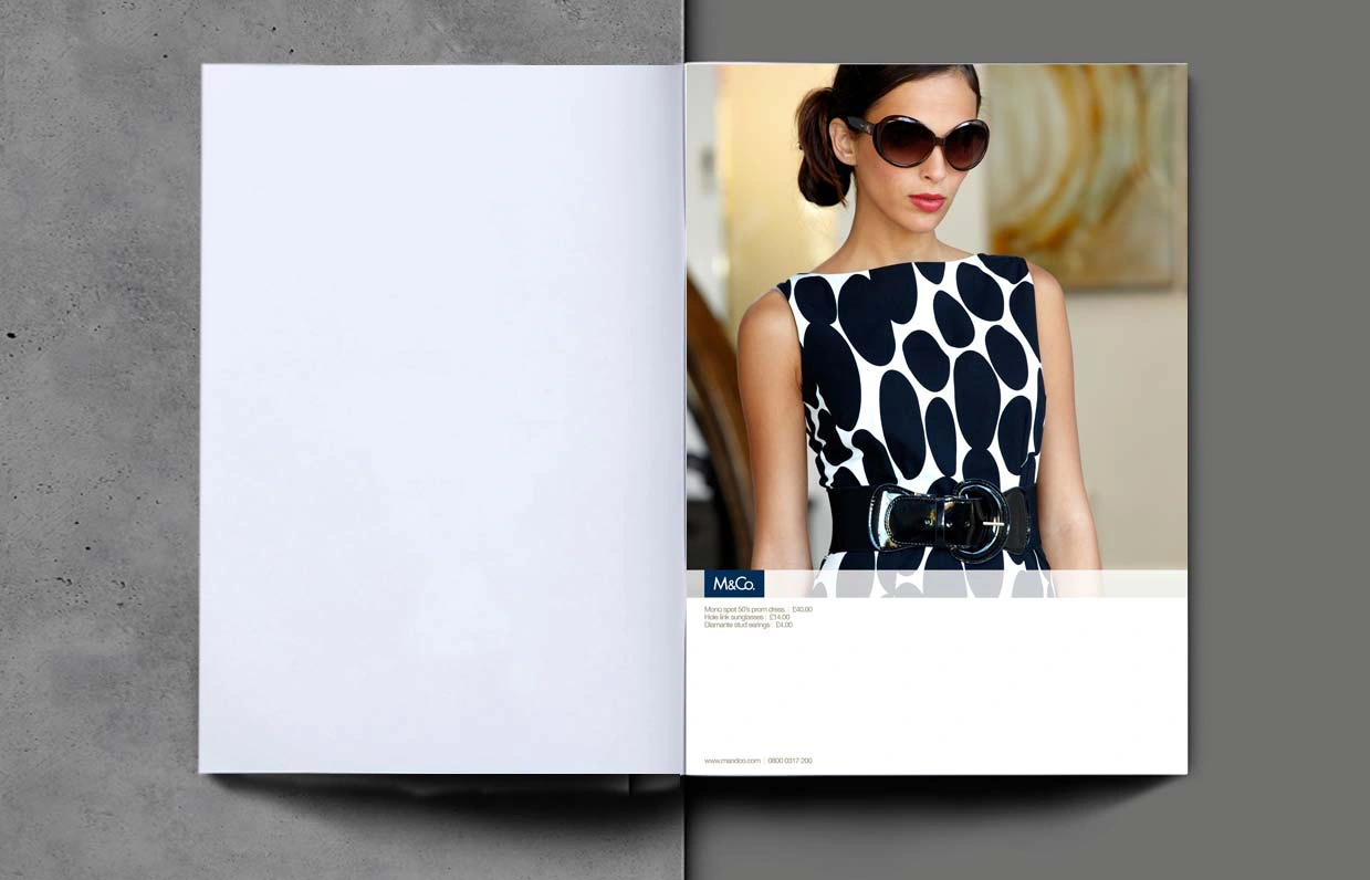
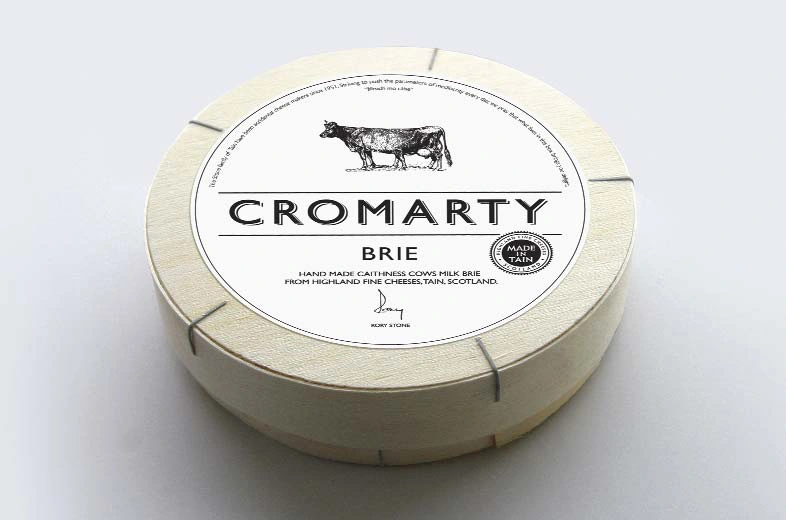
14 / Branding / Packaging
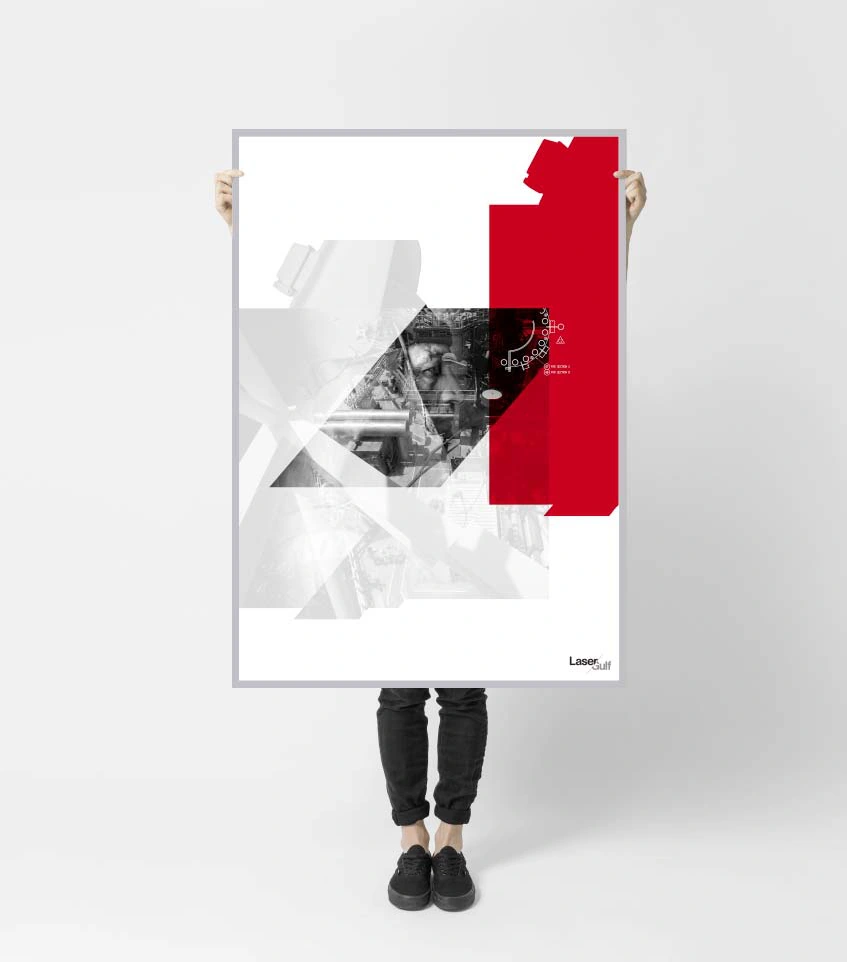
15 / Identity / Communications / Art Direction
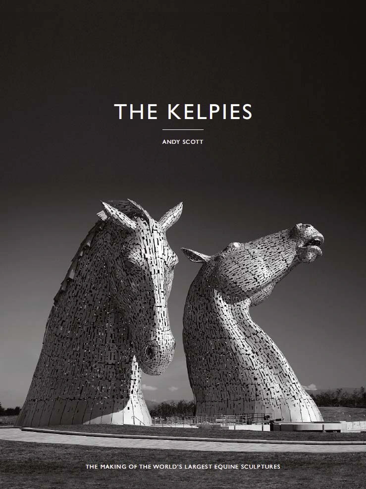
16 / Book / Editorial
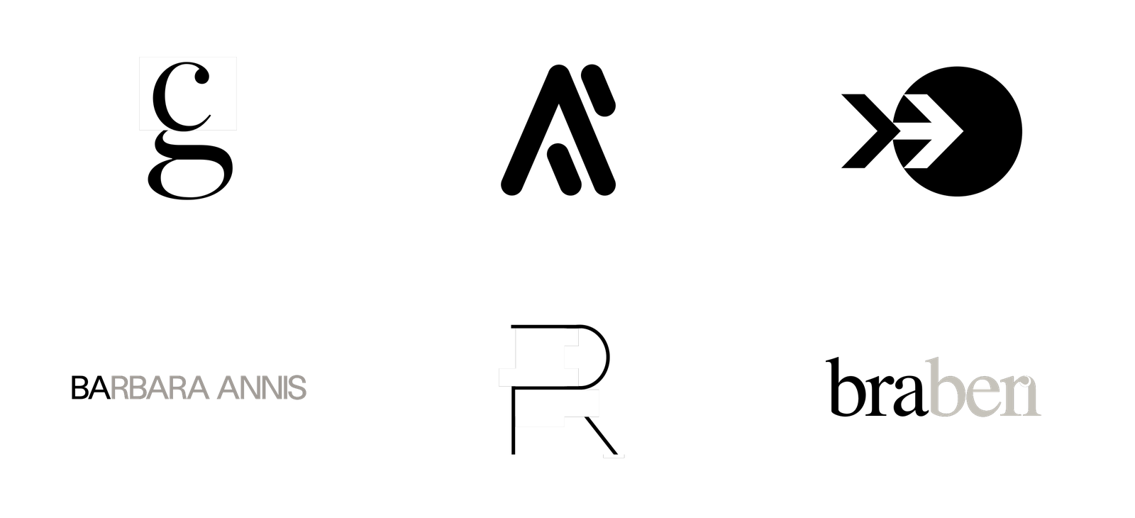
17 / Identity / Typography
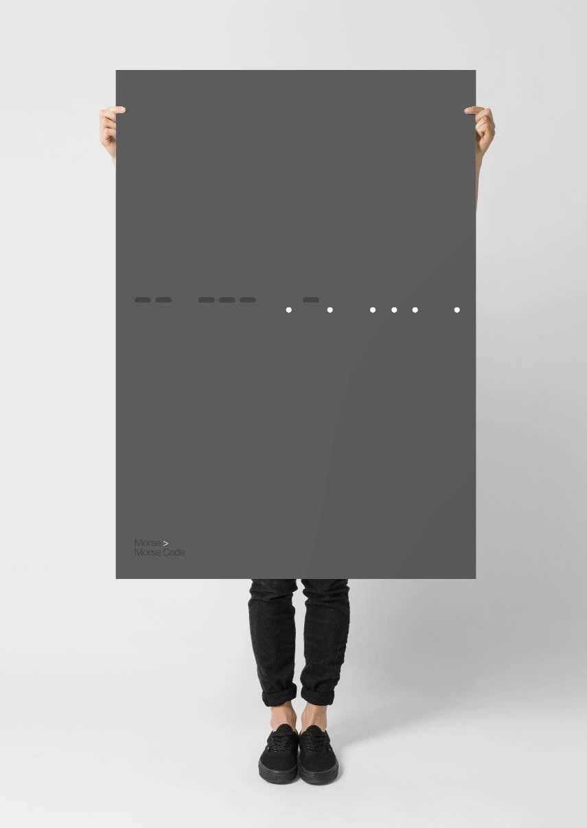
18 / Personal Work / Wordplay / Image
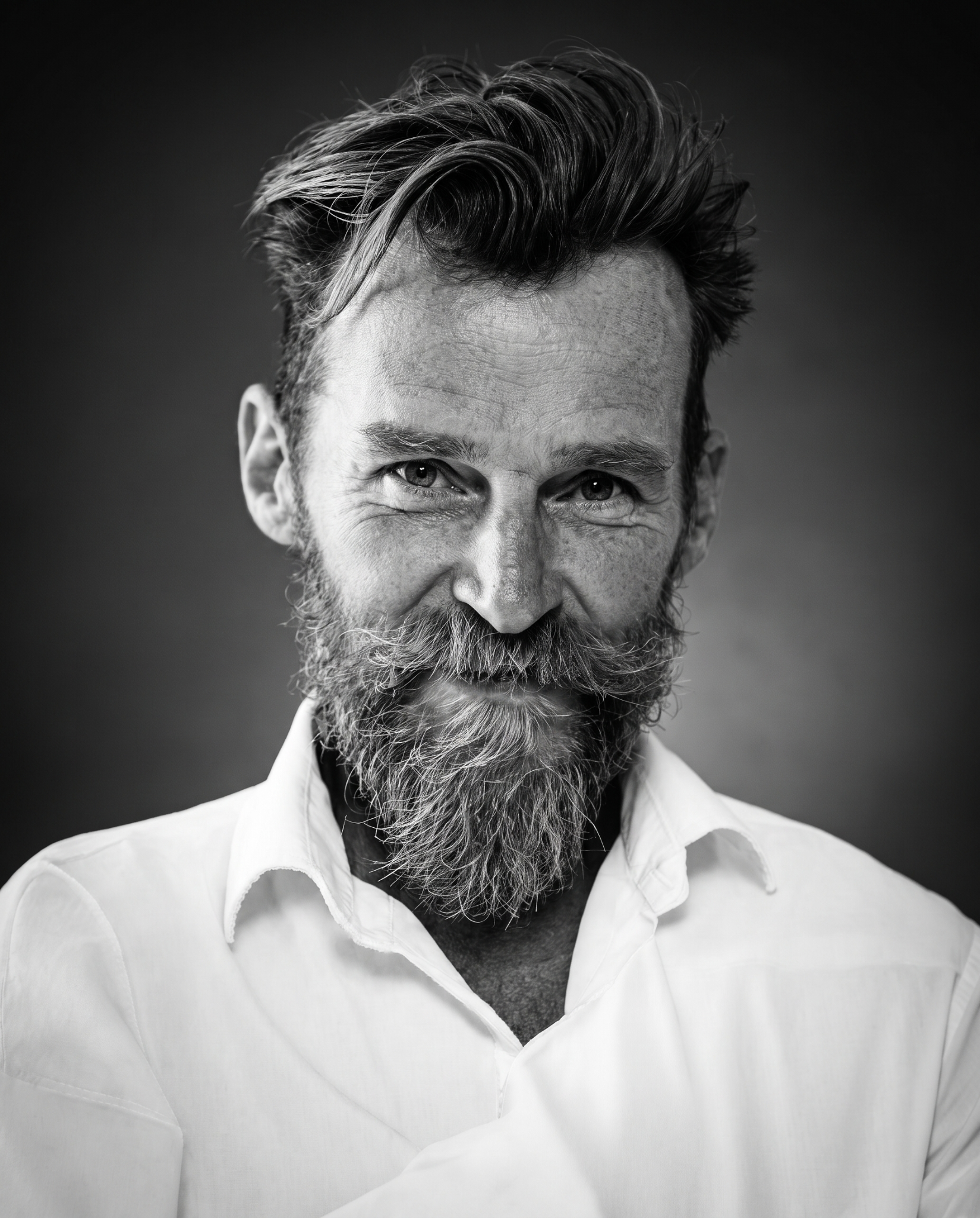
Produce work
that solves problems
and delivers.
I work independently. I also work with people who know more than I do in particular areas. You bring the right people together. You steer. You keep your eyes open to the opportunities.
For me, the thinking and the making belong together. There is a job to do. Then there is the question of how well you can do it.
Design / Identity / Packaging / Exhibitions
Editorial / Photography art direction
“Super collaborative. A thinking designer. Incredibly detailed and conscientious about the work he does and its purpose. And damn witty.”
“It’s important for my business that the work I deliver is bang on brief. Paul brings everything to every job and nails it, every time.”
Glasgow School of Art
BA Honours / Design
D&AD / The Drum
Selected work recognised internationally
Scottish Design Awards
Including the Design Grand Prix
Lecturing / Tutoring
GSA / University of Strathclyde / City of Glasgow College
Contact_
A conversation is a good place to start.
Paul Gray
Suisse Studio / Design & art direction