
01 / 18
Glaswegin
Branding / Packaging
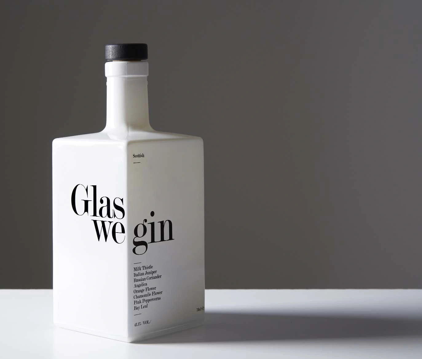
The project_
A bottle that had to hold its own on a crowded back bar.
The brief_
The brief was to design packaging for an entry-level gin from Glasgow. A simple enough request. Behind it, a lot of research into a very crowded market and the way a bottle is seen, chosen and sold.
The observation_
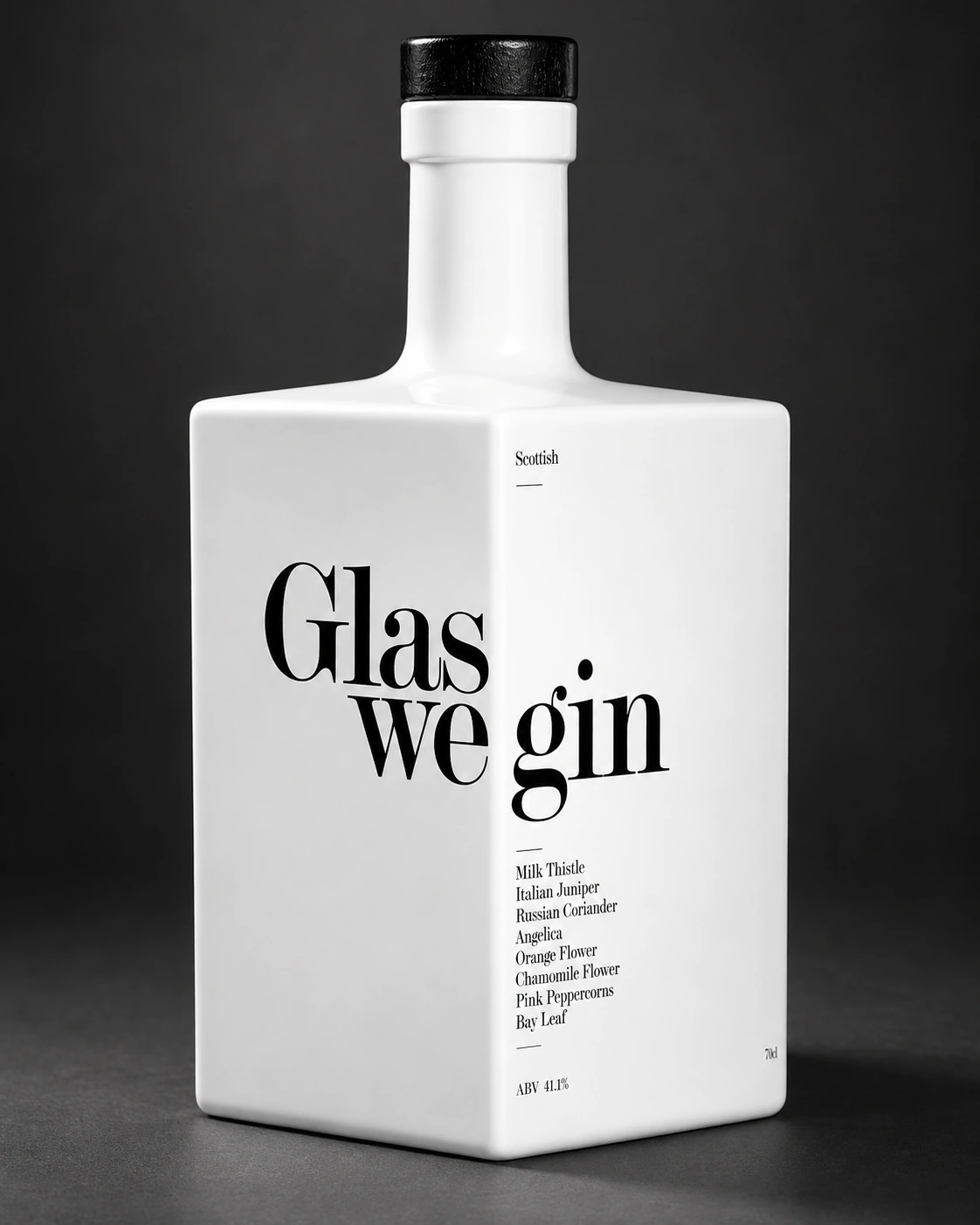
If we used the same graphic language as everyone else, we would disappear amongst them. We agreed on two things: find our own visual language, and make it work on the back bar. The design needed presence at a distance, as well as detail in the hand.
The application_
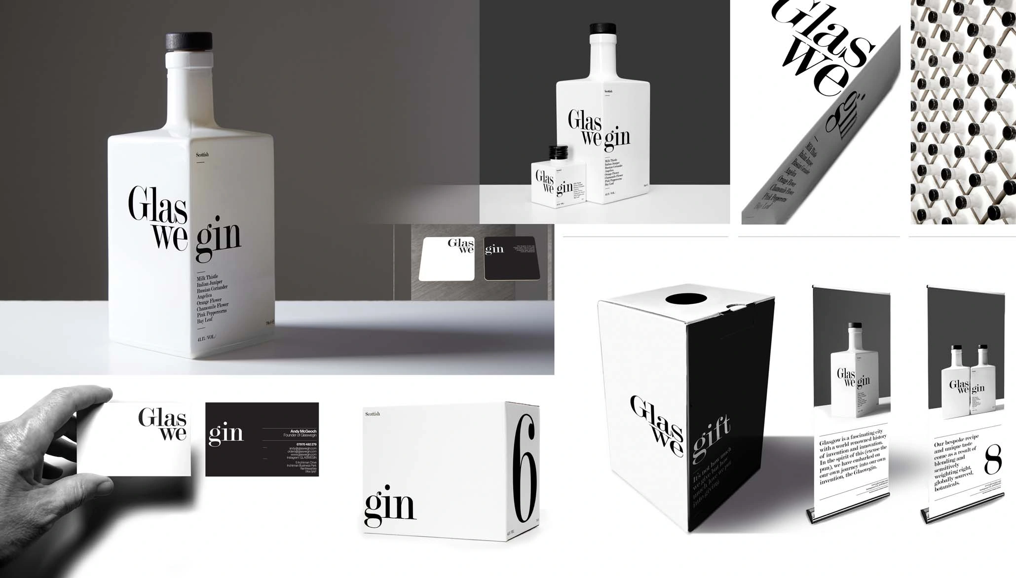
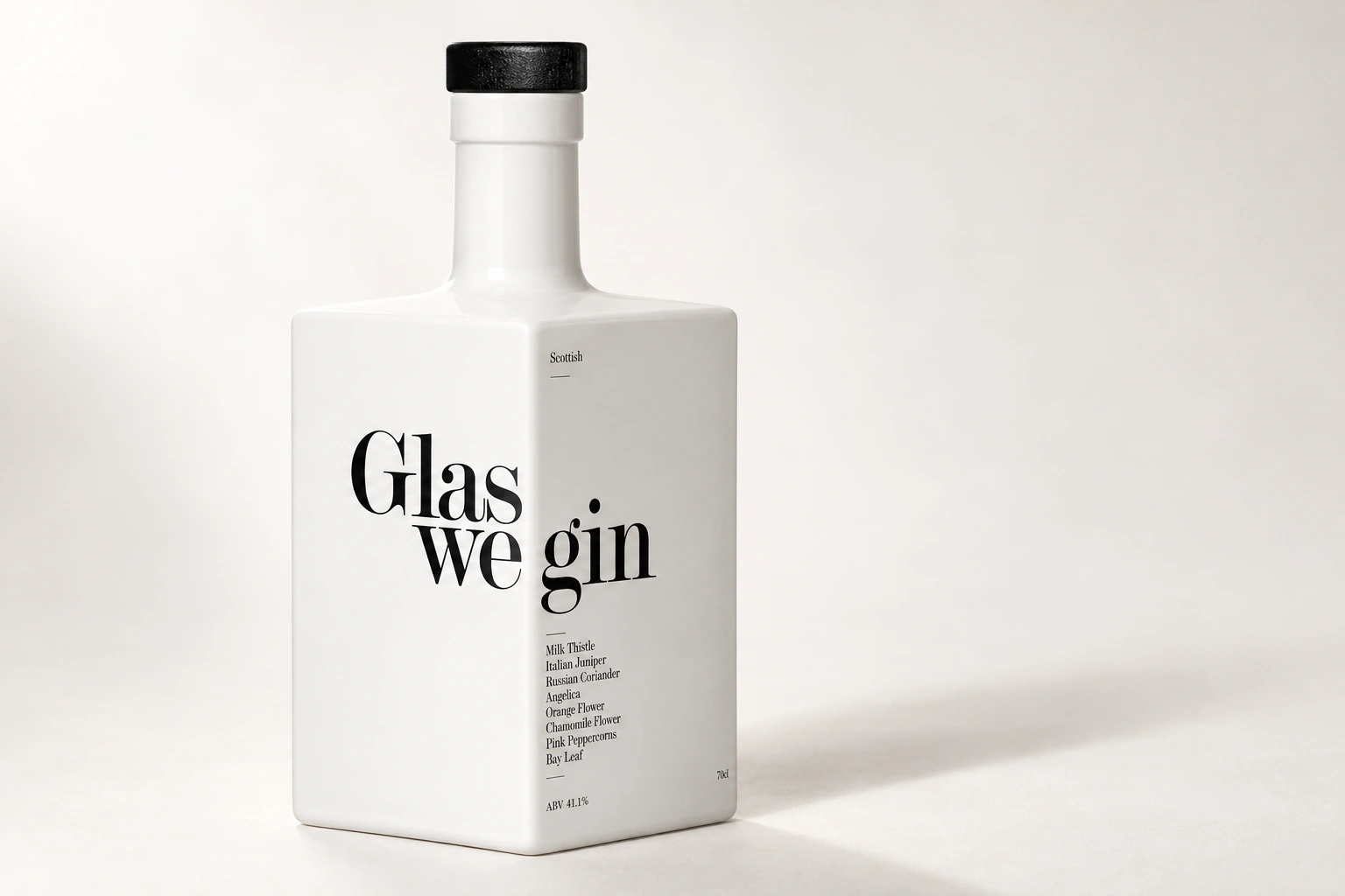
I developed the concept and packaging across the 70cl and 5cl bottles, shipping cases and supporting collateral. The same thinking carried into the brand extensions. A clear, distinctive language with a job to do.
Credits / Recognition
Concept / Packaging / Supporting collateral — Paul Gray, Suisse.
D&AD Pencil. The Drum: Packaging and Chairman’s Award. Scottish Design Awards: Packaging winner and Branding commendation.