
02 / 18
Pictii
Identity / Photography / Print
Approach_
The word. The photographs. The feather.
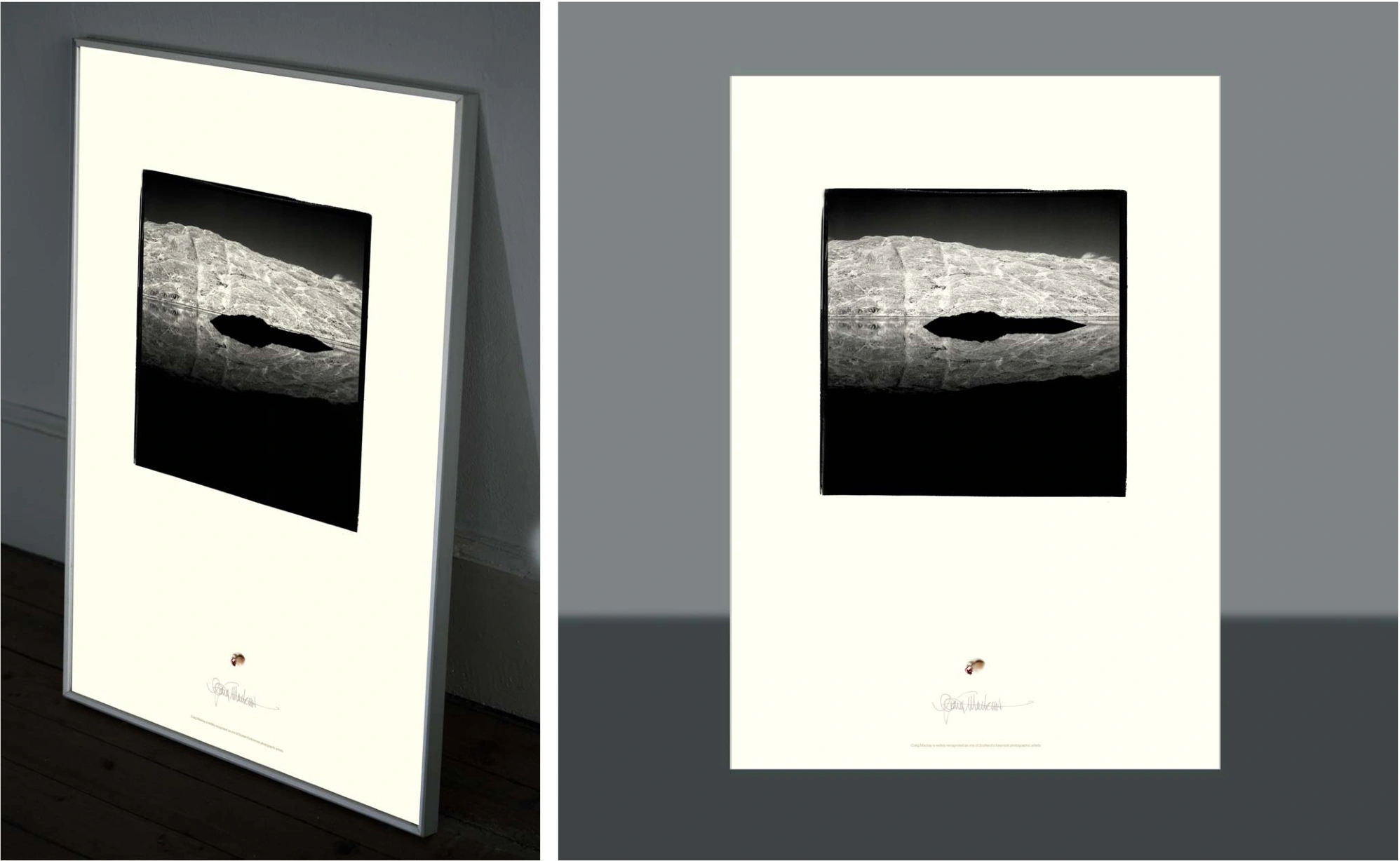
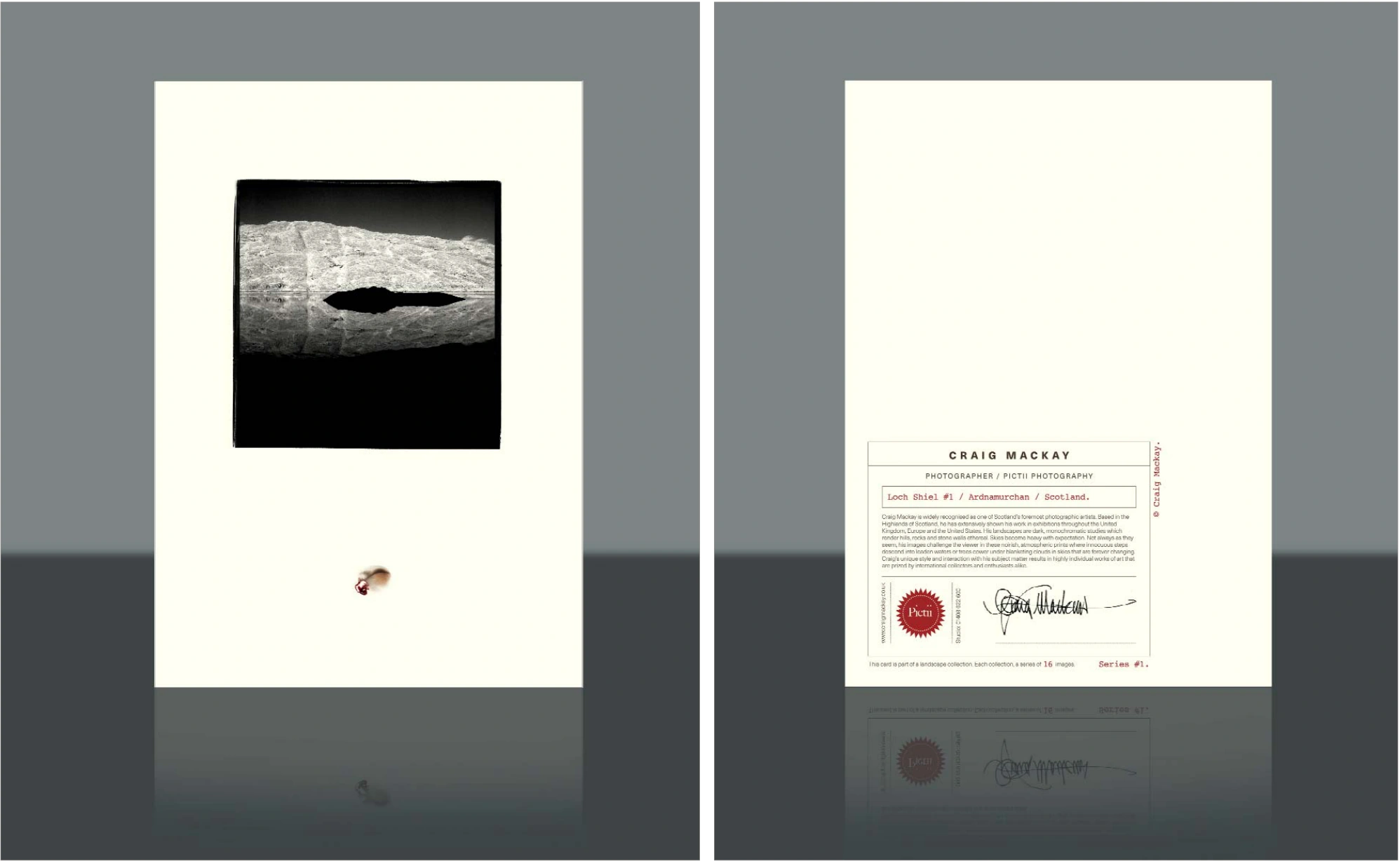
An identity and a series of photography cards for Craig Mackay. The word Pictii was already his. Distinctive, short, and connected to his idea of a Pict with two eyes. It had enough of its own character to become the starting point.
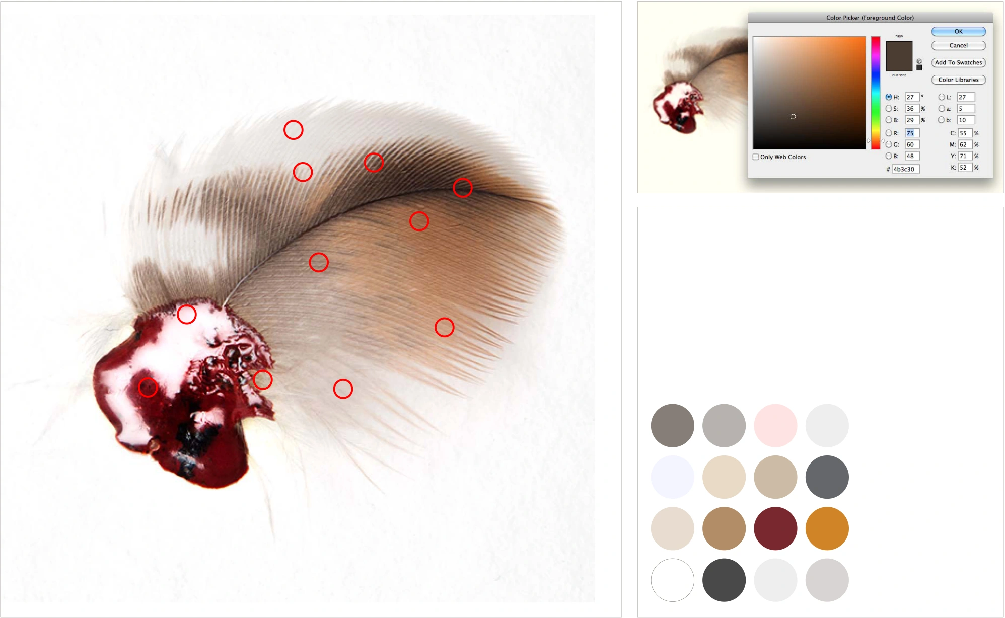
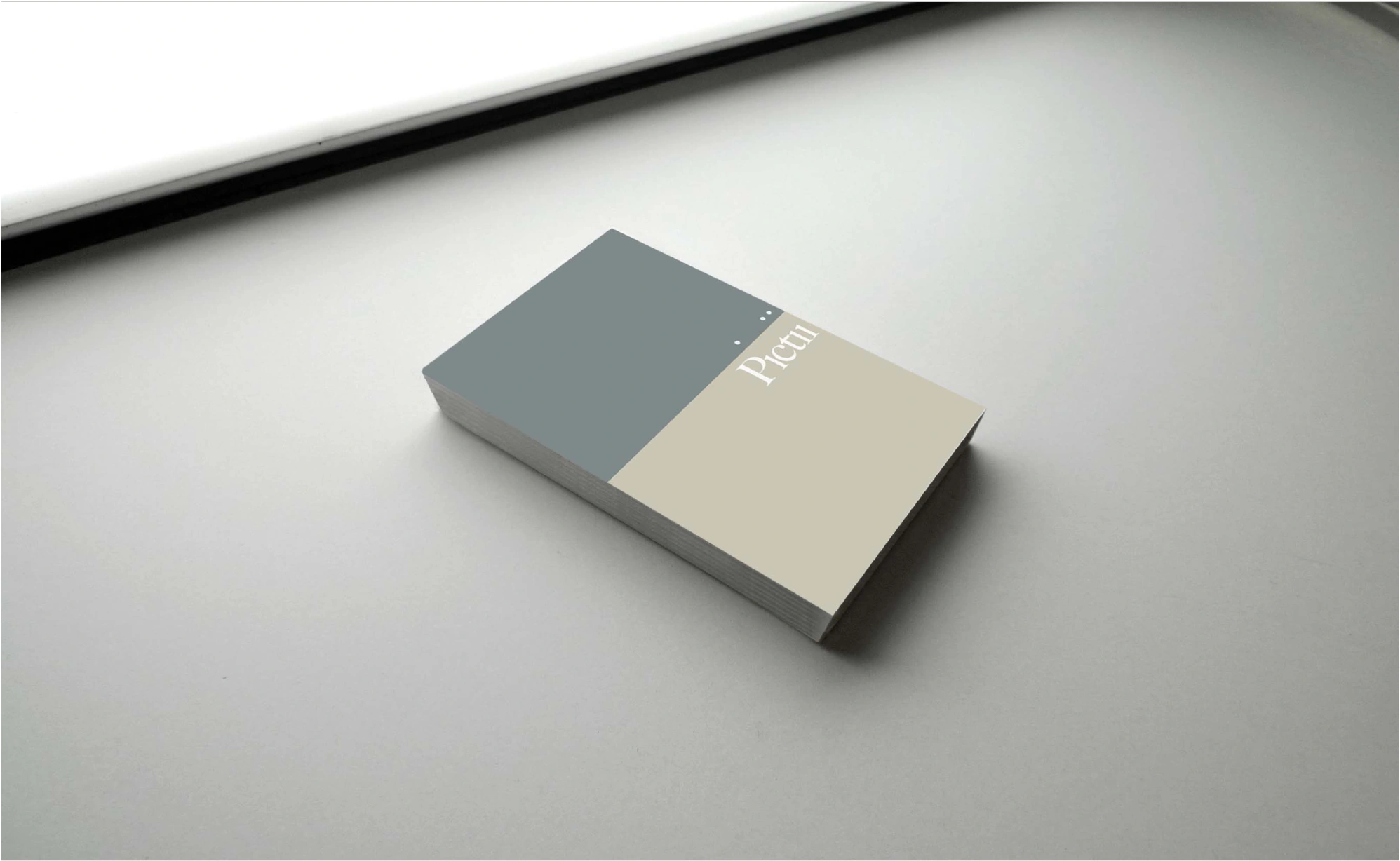
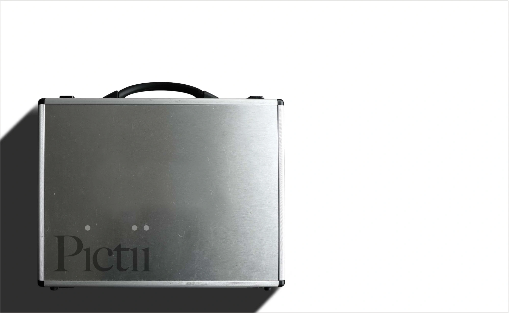
There are three i characters in Pictii. Three dots. Craig often used the rebate of a film frame and a strong horizon line in his photographs. Bringing those observations together gave the name its structure. A feather and red wax seal he used to sign off his work supplied the colours: smoky grey, milky blue, off-white and tawny.
Realisation_
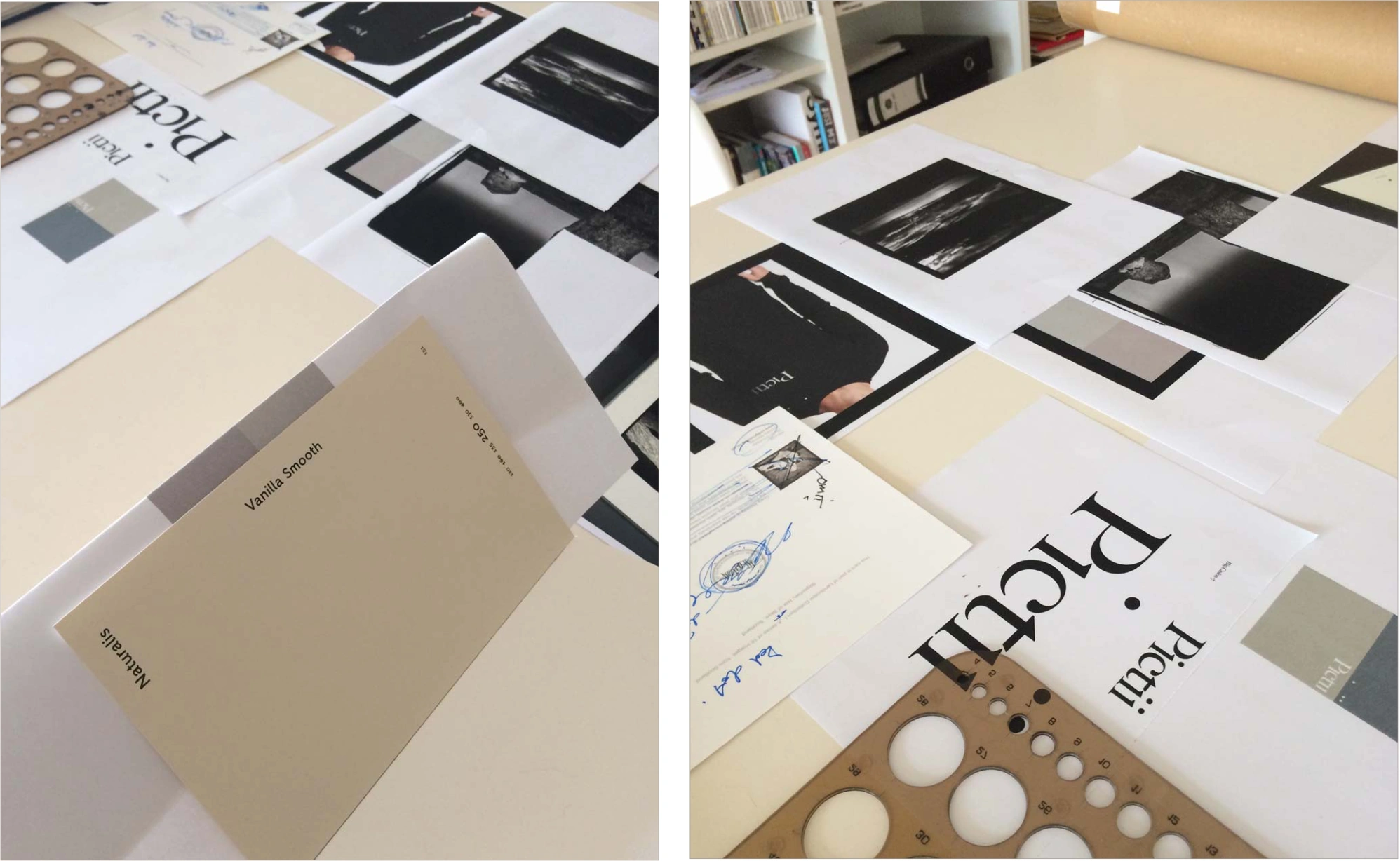
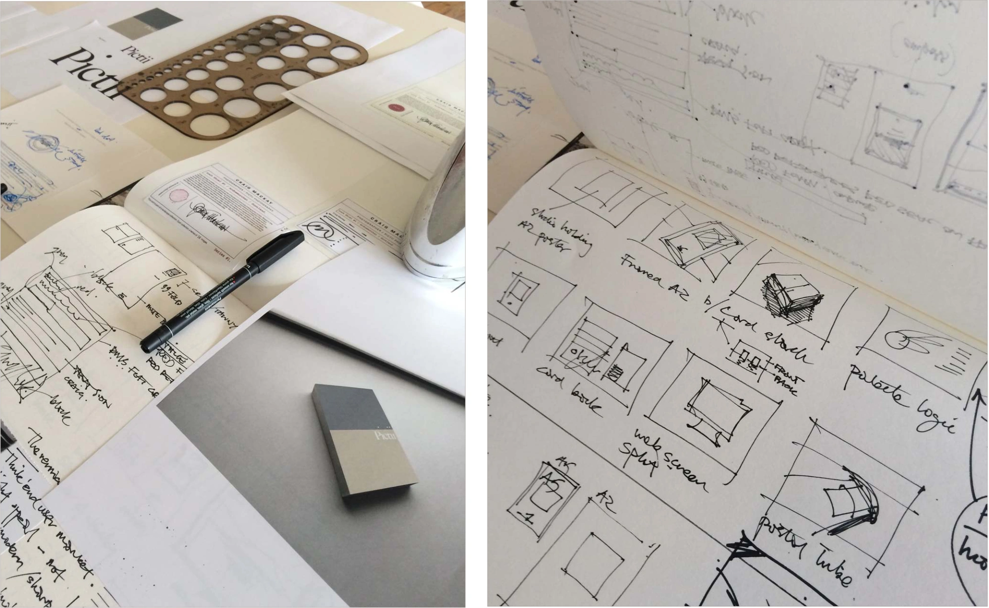
The developmental thinking visualised.

Approach_
Notebooks.
Proposals_
Various applications.
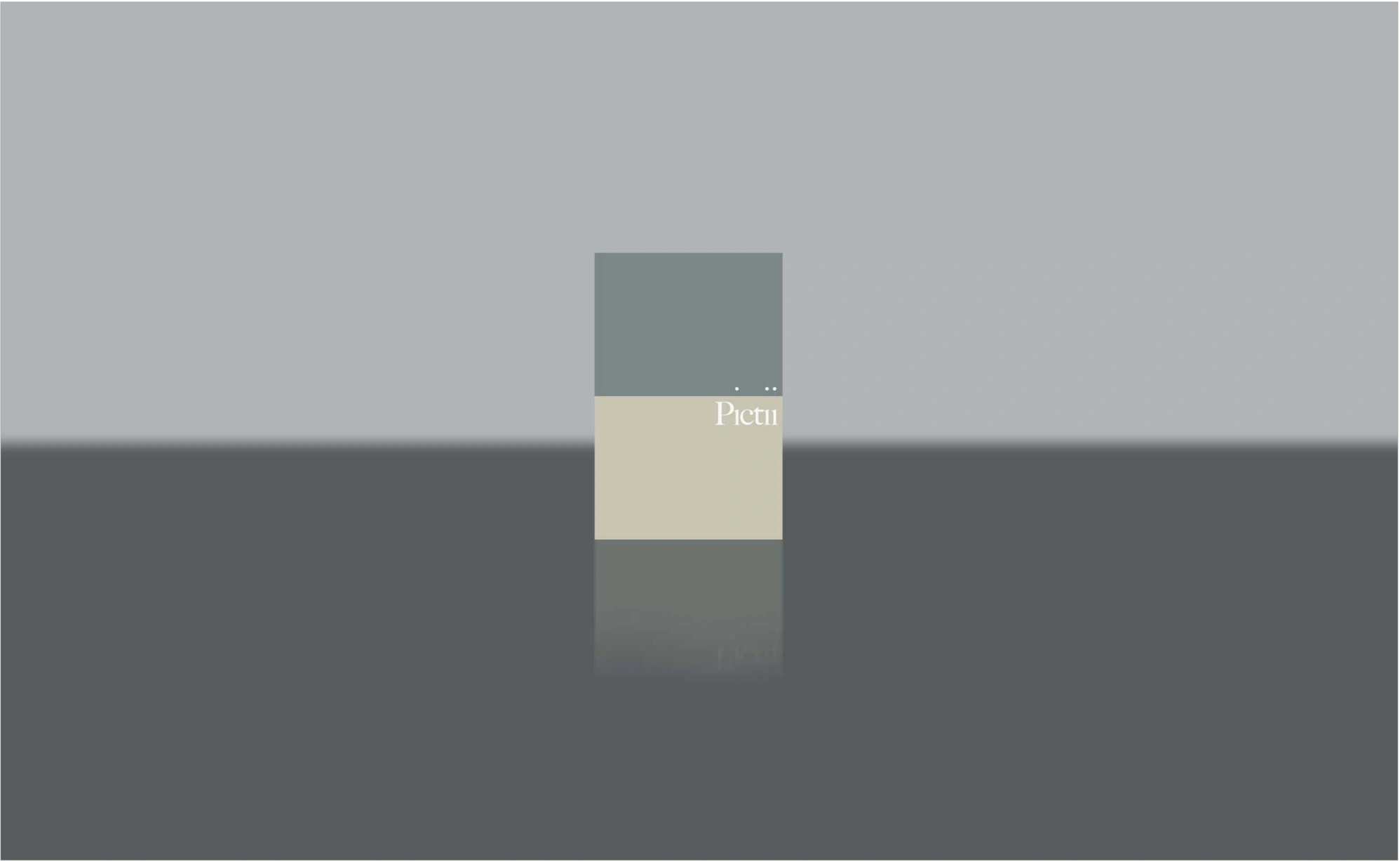
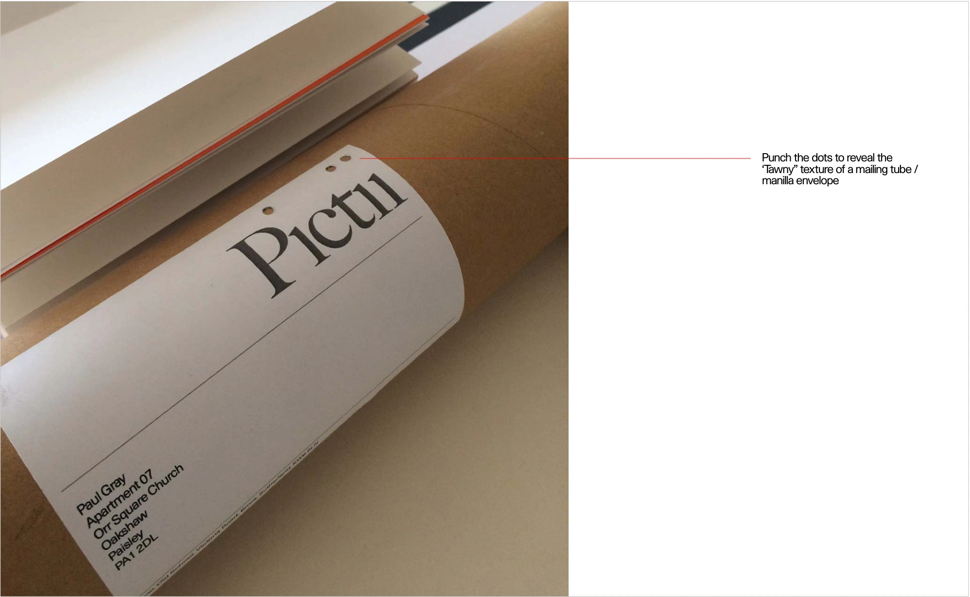
The punched dots reveal the tawny surface of the mailing tube or envelope beneath.
Credits / Recognition
Identity / Print proposals — Paul Gray, Suisse. Photography — Craig Mackay / Pictii. Source presentation dated 25 September 2015.